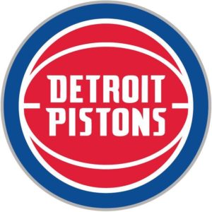
The Pistons Have A New Logo & I Face My Fear Of Writing About The Pistons
Alright so yeah. I don’t really ever post about the Pistons. They have a dedicated category on my website and it only has one article posted under it and it’s not even fully about the Pistons, it’s shared with the Tigers. But with my hometown hoops squad moving downtown and unveiling their new logo yesterday in Campus Martius I felt it was time to finally face my fears and write about the ‘Stones.
I’ll be the first to admit- I don’t know a lot about the Pistons or basketball in general. And you could probably describe me as a bandwagon Pistons fan. If you’re a big Pistons fan and you hate me for this I’m fucking sorry, okay? Like relax I’m sure there’s a lot of stuff you’re not that into that I’m really into. Like Spider-Man and hot dog carts. But in my own defense, it’s not like I’m NOT a Pistons fan, I follow them as much as their record improves. If they are a .500, I might catch kinda like half the games. Maybe. If they were as good as Golden State, you’d see me in a **insert star players name**’s jersey. I can’t hide behind this wall of Pistons ignorance forever, it’s not fair to you the reader, and it’s not fair to myself, pretending I’m something I’m not.
This wasn’t always the case, however. I used to be a HUGE Pistons fan from like 2000-2006. When the ‘Stones were hot as shit and they had the greatest lineup of all time. No joke, my AIM screen name was FearDaFro333. Couldn’t make that shit up. I mean, I could, but I’m really not. Seriously, ask my 7th grade girlfriend Katherine. We used to chat on that shit all the time until my Dad would beat me senseless for being on the computer too long. I played basketball every day and was even on my 7th and 8th grade basketball team. I have proof.

That’s me. #4 right in front, the only one with a basketball not photoshopped over his face. My nickname was “Darko” because I would only come in when we had a 48 point lead with 1:23 left in the game. But whatever. I was a cold-blooded assassin from behind the arch and I loved the Pistons and will always support them.

Me, supporting the living fuck out of the Pistons circa 2010.
So let’s chat about this new logo for a minute.

New logo
I feel like this was the logo the Pistons always wanted. They had a hot logo before and during the Bad Boys era, (1979-1996 to be exact) that was pretty much what this “new” logo is.

1979-1996 logo
Then at the start of the 96-97 season they just lost their god damn minds. They unveiled new logos and uniforms featuring teal, maroon, flaming horses, exhaust pipes, and 3D designs. It was chaos.

96-01
They kept that till 2001, then realized that it was just complete madness and went back to their traditional red, white, and blue. But kept fiery, stead-of-the-grim-reaper, stallion.

01-04
Then some intern in a meeting meekly raised his hand and said, “hey that old logo before we lost our minds was kinda cool?” And the big bad art director in the room was like “yeah I guess it kinda was you little shit. But we can’t just go back to that cause then we’ll look really stupid for doing this whole flaming horse ordeal. I’ll mock up something similar to the old logo, but it will be sooooooooo much more mid 2000’s. Because we’re so fucking hip.” That gave us this…

Which is about as exciting as paying your utility bill. Then, with the move Downtown, the creative team out in Auburn Hills was trying to think of a way to add a little spice (and sales) to this move and thought it would be a good idea to update the logo…again. That same intern, now hired full time, suggested going back to the old logo. The whole team agreed, but decided it couldn’t be the EXACT same logo as the 80’s & 90’s one of the past, but were willing to get closer to it than they did last time. So they took the font from this mid 2000’s one and smacked in in the middle of the 90’s logo and called it a day. And the Pistons themselves even half-ass admit that with their logo reveal video.
A New Chapter.
Here's the story behind our updated look: https://t.co/YMSajIKXjT #DetroitBasketball pic.twitter.com/2VpEVXnnVb
— Detroit Pistons (@DetroitPistons) May 16, 2017
Toss in a little silver rim and give some bullshit reasoning behind it to make it seem like there was an ounce of creative effort put into this and- Bam. Logo.

Hooper
So what do I think of it? I think it’s spectacular. I really do. Simplicity is king when it comes to sports logo/uniforms and I’m excited to have the hoopers and Hooper downtown Detroit.
Go ‘Stones.
Phew. That wasn’t as bad as I thought. 🍾
– Frank


